Project CSS framework
Introduction
In the lead up to the start of a new project with our first external client, I decided to use Sass to make my own custom CSS framework. By this point I had completed several web projects, and I recognized there were many styles I was rewriting over and over again. My team had difficulties working with some existing CSS frameworks in the past, in particular ones that used JavaScript to add extra markup to the HTML. It was harder to predict results and sometimes conflicts arose, especially with our legacy code base. I therefore set out to make a simple CSS-only framework to help keep my code organized and establish a core set of reusable and flexible components.
While I did implement a basic grid structure akin to Bootstrap, I ultimately found that responsive design would almost require custom solutions. Built before I adopted CSS Grid and Flexbox, I created a basic grid structure using floats and widths in percentages that would suit most cases, and then wrote custom CSS on a case by case basis for layouts that needed to be responsive. I even created a mixin that I could invoke if all I had to do was set a multi-column layout into a stacked single column layout, one of the most common responsive design scenarios. I also included classes that defined vertical spacing that I could reuse on various elements throughout the project. In the first iteration I began with values that I used frequently, such as 10px, 20px, 30px, etc., and then in a later version implemented a project-defined variable as a basis for spacing, thus creating a more harmonious vertical rhythm throughout layouts (more on that below).
Case Studies
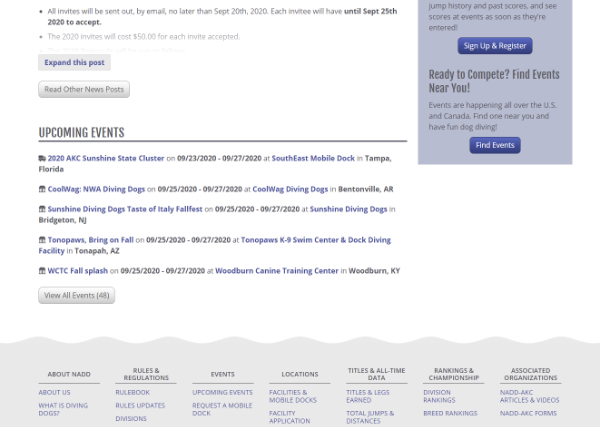
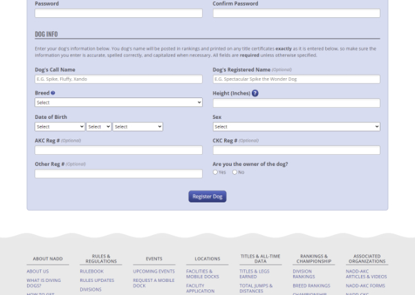
NADD
Our client was treated to the first iteration of the CSS framework. It allowed me to build pages very quickly, and then the lead developer was able to use it for updates as the project moved forward without me (for small updates and quick changes). Button styles were one of my first components, in the examples below gray buttons and purple buttons shared a common class defining their font size, padding, and rounded corners, and alternative classes were used to define the colors. I created an alternative version of the main grid system specifically for form layouts, allowing for a variety of column combinations depending on the content.
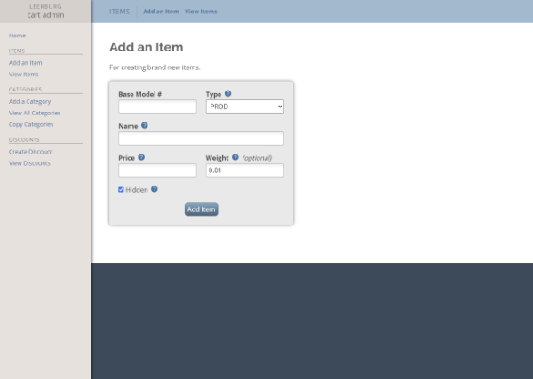
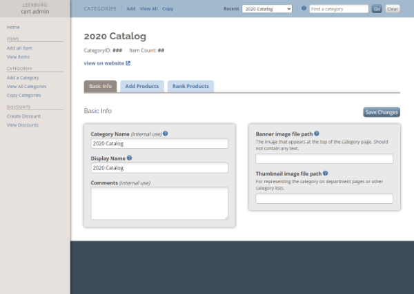
Leerburg Admin
Cart Admin is one of Leerburg’s legacy systems that had been built in the early days of Web 2.0. It had a basic design with pages largely consisting of black text on a white canvas, and it had inconsistent methods of navigation and content layouts. Due to our limited resources we could not rebuild these systems from the ground up, but they were blank canvases on which I had a unique opportunity to greatly improve the user experience and interface. Internally, pages I have updated were dubbed “cosmetically updated”, which I have since simplified to “beautified” versions, as much of the old logic remains.
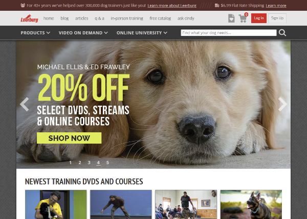
Leerburg
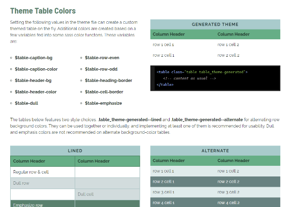
In every instance of the framework I use variables to quickly generate unique themes. These variables are declared at the project level, and include basic elements like default anchor tag and table colors, fonts and font sizes. In this way, sites based on the framework can have different personalities right out of the gate.
In the most recent iteration, I updated the framework to handle multiple themes for complex projects. Initially cart admin and the public facing portion of the site required their own copies of the framework, but now can share files as the unique themes modify each area’s particular look and feel.
Journey to 2.0
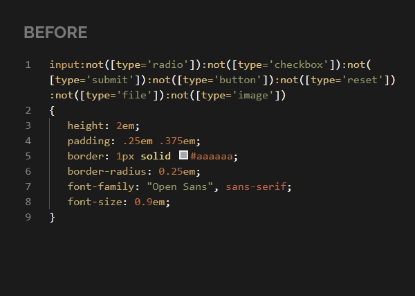
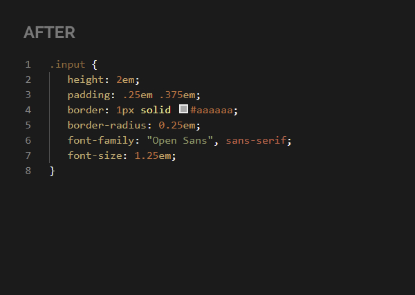
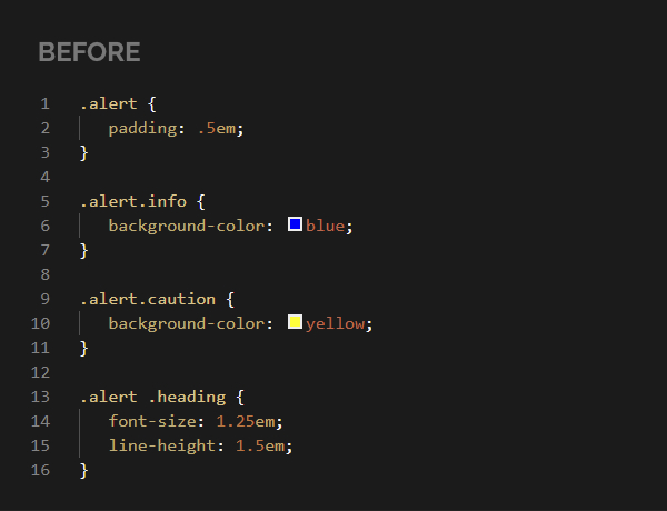
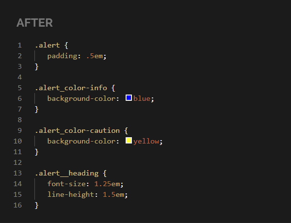
After two years of using the framework, certain flaws began to emerge. In particular, early on I had made the choice to target some default styles by element type rather than by using classes. It made sense at the time since the projects I worked on had similar visual styles, in particular form fields, but it made it incredibly difficult to write custom styles. I even wrote a default style for all inputs of various types using compounding type selectors! (It was my attempt to be specific, target only fields that accepted text versus checkboxes and so forth). Naturally in doing so I reached max CSS specificity, making it difficult to overwrite old rules with new ones.
When I came across BEM (Block, Element, Modifier) methodology I knew I had the solution to my woes. This method was the key not only to make my code more readable and reusable, but incredibly more flexible for changes. Its flat structure meant less fights with specificity with exceptions as needed, like if I wanted a theme style to modify a child element of a block. Rewriting most of the default classes (and elements that did not have class equivalents) was an arduous undertaking, but a labor of love and I am proud of the result.
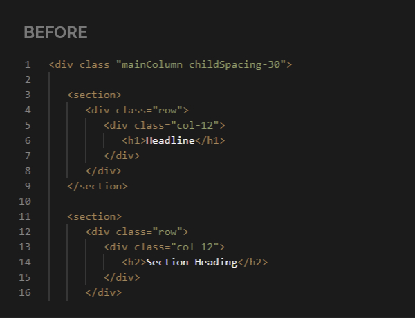
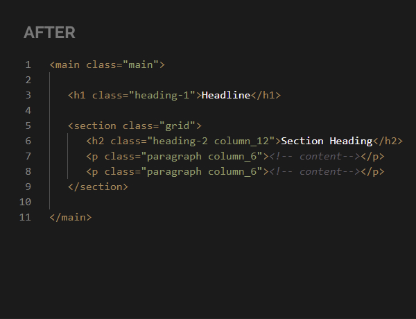
Another task I undertook was rethinking my earlier “section / row / column” grid structure and how I was using HTML elements. Accessibility is incredibly important and something I want to improve on in my web projects. Additionally, well marked up content is great for search engine optimization. To this end, Firefox’s accessibility tree was a great resource. It helped me visualize how the page’s content was interpreted for screen readers, and led me to simplify my approach to create the most concise markup that I could.
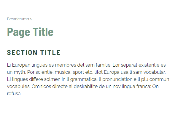
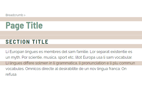
Lastly, I wanted to apply the lessons I had learned in web typography. A particular lesson that really impacted me was Matej Latin’s “Rhythm in Web Typography” in their Better Web Type project. Instead of using arbitrary values in base 10 for my vertical margins, I utilized the values of the body type’s text height to generate my margin bottoms, tops, and grid gaps. I created mixins and default utility classes that produced values as multiples of this base value, thereby establishing consistent spacing throughout a project’s pages.
Documentation Examples
Interactive Elements
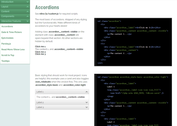
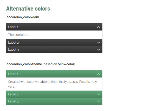
These were elements with scripts that we commonly reused project to project, gathered in the framework to have one consistent go-to version with accompanying example code. In this example, I created simple accordion lists and separated the classes that handled functionality from the ones that determined appearance.
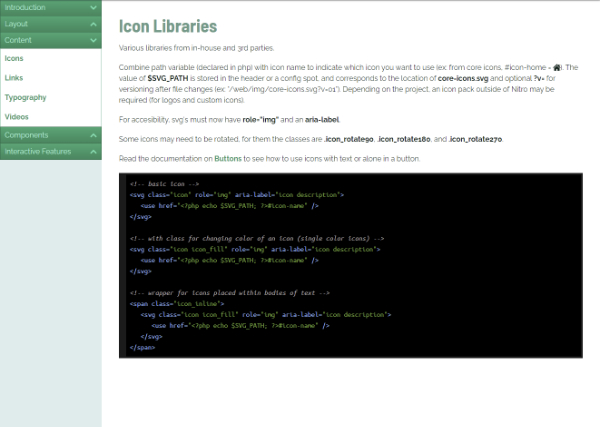
Icon Library
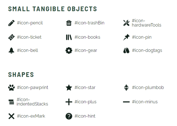
I developed a custom icon library to use with the framework. They included many icons that were frequently used throughout user interfaces, like arrows, printer icons, open page in new window, and along with some unique symbols added for specific projects (like the splash icon to represent a jump attempt in a NADD event).
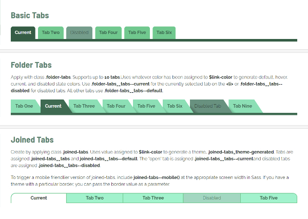
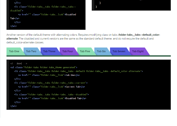
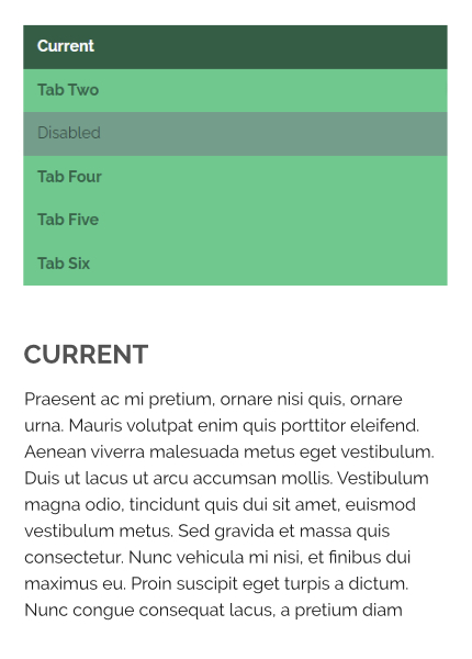
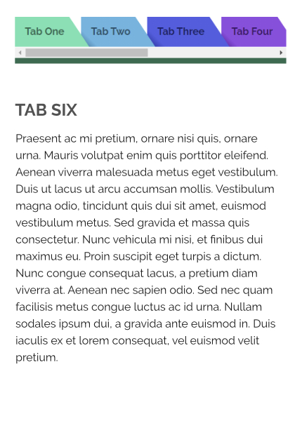
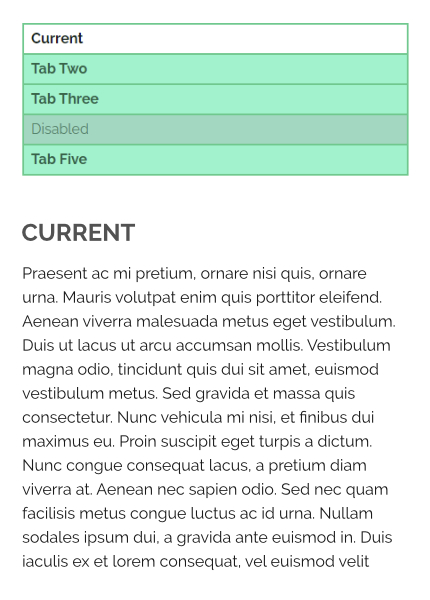
Tabs
Tabs are often used in complex interfaces, and in this framework I got the opportunity to experiment with different visual styles and techniques. These ‘“tab systems” utilized the color assigned to the $link-color variable to generate different themes. The alternating color variant of the “folder” style was a lot of fun, and really demonstrates the power of a CSS preprocessor.
I also had to think about how these would respond to narrowing screen widths, so by default the parent element shows a horizontal scroll. If the developer so chooses, they can also invoke a mixin that converts the tabs to mobile friendly version.
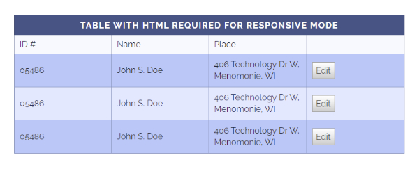
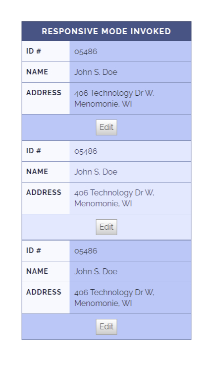
Tables
Tables. The bane of responsive development, their structure resists simple solutions, or rather perhaps the nature of tabular data resists living on small screens easily. I do not recall the original source of the solution below, but with the help of additional markup and a custom mixin, a version of tables in narrow screens was possible.
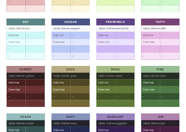
For fun I experimented with Sass functions and created some predefined table themes. I took two starting color values and used lightness contrast functions to determine appropriate contrast text colors for each table row. At the end of the loop I turned the hue 45 degrees to produce the next color, doing so 7 times, and repeated the same method for a dark version to produce a total of 16 color schemes.