Project Product page redesign
Overview
Role
Lead UX Engineer & Designer
Business Goals
Increase customer conversion rate on product pages.
User Needs
See social proof, product options and media in a way that makes it easier for them to decide if the product is right for them.
Process
- Researched competing e-commerce websites and substitutes for ways to differentiate the Client from the competition.
- Incorporated design elements that would benefit the user, like sorting reviews by rating and representing product options with thumbnail images.
- Synthesized findings into mock-up of the page design in Photoshop and developed for the web using HTML and CSS.
- Created small user interactions, like "Read More" buttons to expand product descriptions and reviews, using jQuery.
- Assisted back-end developers in applying PHP to create scenario dependent messaging and fill content stored in the database into a single-file template.
Show, don't tell, options
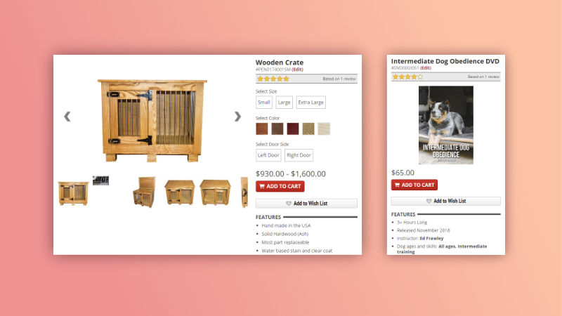
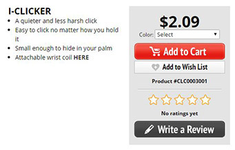
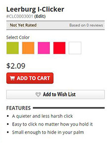
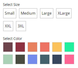
In the initial page design every product option was listed in a dropdown. For some products this is necessary, such as dog collars that could have over twenty options to select from. In most cases options are few enough that it was worth it to show the options outside of a hidden list. Doing this means users can view all their options at a glance. Additionally, I hypothesized certain options would benefit greatly from using image thumbnails instead of a label, like colors and materials.
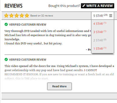
Organize customer reviews
In the original layout product reviews were under a secondary tab, reducing the odds they'd be viewed by a user. The reviews were not sorted by star rating and were listed in a two column layout. In the redesign I grouped the ratings by star and showed the number of reviews for that rating in the rating navigation. This way users can easily choose which reviews they want to read and see at glance if the number of positive reviews outweigh the number of negative ones.
In addition, I added a tag to reviews that would indicate if a review was written by a person who had actually purchased the product. A review marked “verified customer review” would lend it more credibility for the user. If a negative review was missing that tag (was submitted anonymously by a user that wasn’t logged in), the prospective buyer might dismiss that review as unreliable.
Room for Improvement
Firstly, this project was designed and launched without user testing. The client and I were confident in our hypotheses that key changes would make the page easier to use, but user tests are critical for making sure our assumptions are accurate. Additionally, aspects of our solutions might have been improved with user feedback. For instance, while the option thumbnail images are great for most users, there are situations where the material or color label might still be needed. We included alt tags for our users who use screen readers or utilize hover states, but we've since had incidents where a user knew the name of the option they needed but couldn't tell which option to choose (perhaps it was a shade of blue and two blues looked too much alike). Without user testing, we might still be missing opportunities to improve the efficacy of the layout.
Secondly, we did not iterate gradually to see how well specific changes impacted conversion. Going forward we should take more opportunities to iterate and A/B test small parts at a time. While we cannot tell which parts contributed to the overall site conversion rate, the net effect was an increase of 33%. Unfortunately we did not set up specific data collecting with internal or external tracking sources to compare the new design with the old specifically, we only measured site wide changes for periods before and after the design launch. In hindsight, even with high confidence of success, it would have been illuminating to have this data and is something to remember to set up properly in future projects.
Lastly, we should look at ways to improve social proof. Like most e-commerce sites, the Client relies heavily on user submitted product reviews for social proof, but unfortunately many of their products have no reviews. Given the Client's size and proximity to their users (a family-owned business where customers often email the owners directly for dog training advice), it would serve them to use these connections to gain more personalized reviews. Additionally, putting faces and real names to statements is proven to be more effective than large review databases with faceless and anonymous users. Reaching out to past customers (especially ones who gave rave reviews) and highlighting their stories could be a more effective way to approach social proof.