Project Shipping label management application
Overview
Role
Lead UX Engineer & Designer
Business Goals
Cut down on shipping costs and improve warehouse worker productivity.
User Needs
Have an application that is easier to use and less error prone.
Process
- Researched desktop design conventions, relying heavily on Microsoft's Windows Dev Center documentation.
- Interviewed users and observed how they used current software to better understand their needs and workflow.
- Documented project requirements and mapped out the project's scope, breaking down complex pieces of the app into smaller tasks.
- Built prototypes of the application in Adobe XD to get initial user feedback on the UI, and clarify with the development team what components we were building.
- Worked with back-end developer to come up with solutions on how to handle different use scenarios and ways to reduce user error.
- Developed visual design in XAML (WPF) and used C# to build small interactions, like pop ups for messaging and data entry.
To protect the Client's intellectual property, some images have been altered or are an incomplete representation of the final product.
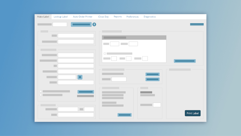
Capturing the project scope
This assignment tasked my co-developer and I with creating a new shipping label manager application to replace two programs our staff were using. Our version of the FedEx Ship Manager at the time was not maintained well by FedEx's development team (being in the midst of working on a new one themselves), and the program was powerful but bloated with features that we did not need. Our version of Indicia's application for USPS labels was very old and failed often. Ultimately neither completely suited our needs, and the users found it frustrating to have to use different applications to make labels for the respective shipping company.
I was brought on board while the back-end development was already in motion. I conducted users interviews and demos of the current applications to get a feel for what our users needed the application to do for them, and how best to transition their workflow from the existing applications to a new all-in-one program.
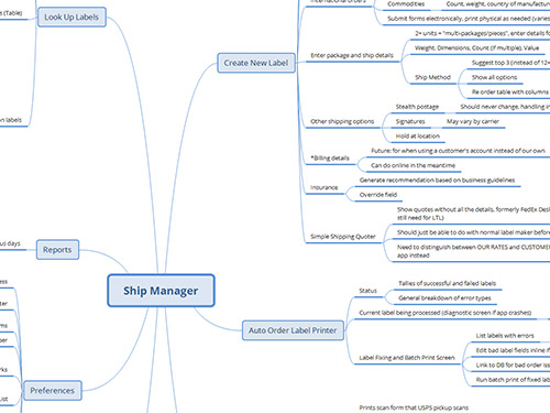
I consolidated my findings into a series of flowcharts using XMind and presented the results to the development team. We were able to use it to document the scope of the project, defining must haves and nice-to-haves. It greatly aided my work in developing the information architecture of the application, and help the team get on the same page on what we were building.
Prototyping for discovery
As handy as a flowchart is, most end users get a better sense of an interface from an image. Creating simple prototypes in Adobe XD enabled us to present our ideas before starting development. While not as powerful as other tools like Axure, Adobe XD enabled me to at least simulate user interactions, like how the screen would change when the user clicked the main navigation or show pop ups that would appear if certain buttons were clicked.
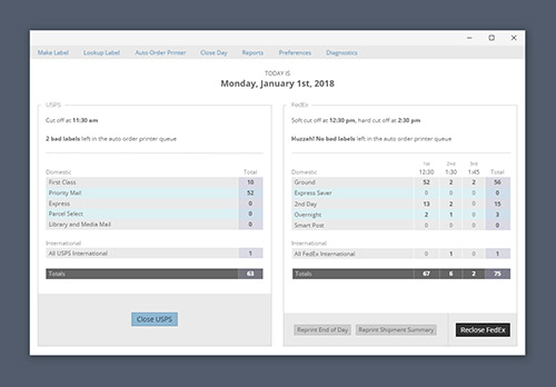
During this process, we discovered important features that we missed during our initial user interviews. For instance, our warehouse staff might “close” a shipping service multiple times a day, and not just once like I had assumed. The development team had to think about showing data for multiple close times (number of packages at each time stamp) and plan for additional actions.
Iterating after launch
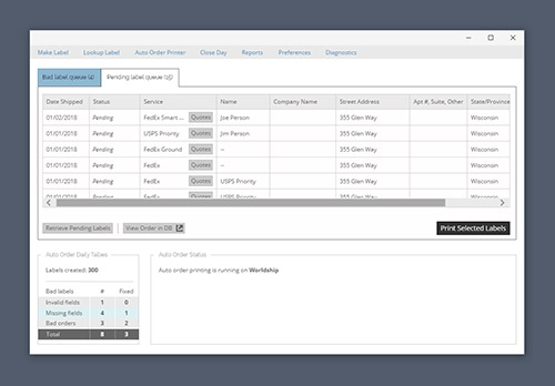
Even with the best laid plans nothing in development is perfect. We had a unique situation arise after launch with “pending labels.” We had to account for labels from the auto order printer would be put “on hold” after a specific time so the warehouse workers could focus on the orders that had to go out that day. In rare occasions, a label may be sent to the pending queue but would need to go out that day. So, we modified the auto order printer screen so users could see the pending labels, and push the pending label to print manually.
Room for Improvement
The biggest lesson learned from this project was how important project planning and user testing is. We have a small team of in-house users to collaborate with so we tend to develop and design on the fly. Fortunately we're in a position where it's realistic to work this way (we can rapidly deploy bug and quality-of-life fixes as soon as the users alert us to a problem or difficulty). That said, we can always strive to do better for the next project.
Defining project goals and having useful documentation are essential to development. Often our developers work alone, so it's natural to approach a project in a more cerebral way (nothing written down, containing all the details in one's head). In teams, however, this makes it harder to on board new team members, and I had retread a lot of ground that may have come up months prior. Documentation is a useful resource for tracking project progress, setting and meeting deadlines, and keeping track of changes and decision making.
Showing the users a prototype that was essentially a few animated mockups and emulated interactions was a good start, but ultimately it's still better to have user testing that actually tests task completion. With data entry there are a lot of pieces and odd scenarios that we missed when our testers just passively looked at a series of images. We would have gained a lot of insight if we had a tool that could simulate the interface and let users actually tab through it and enter data. Unfortunately products like Axure were outside our budget, but I could have whipped up a quick web version that would have been near identical experience.