Project B2B Marketing Website
UX/UI Design + Brand Cohesion
Background
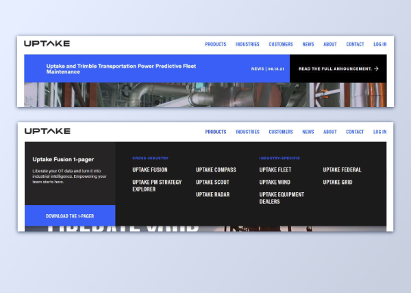
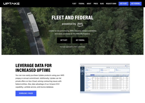
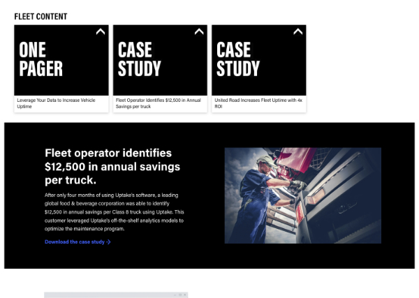
Uptake is a transportation predictive maintenance software-as-a-service provider. I joined Uptake at a time of change that would last throughout my tenure. During that time the business goals shifted periodically to reflect the company's capabilities and market feedback. For the marketing team, this meant changing web content strategies, and, for the product managers, redefining the product line. As such the marketing website needed to reflect these changes in a timely fashion. The screenshots below is what the site looked in 2021.
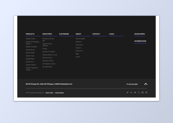
Transitional Update
Phase one of updating uptake.com focused primarily on working with the design and layout as it currently stood, allowing me time to familiarize myself with the code base and technology environment. Making meaningful, easily achievable changes meant I could focus on completing updates using coding best practices and in a timely manner.
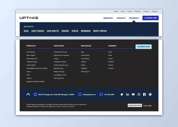
Brand Update & Business Focus
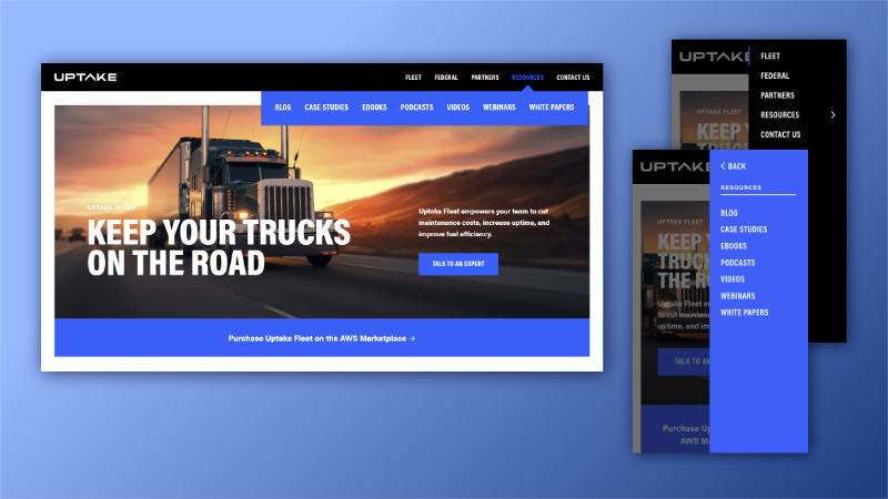
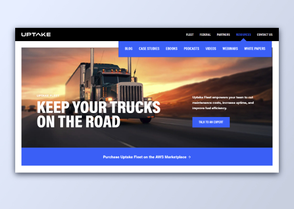
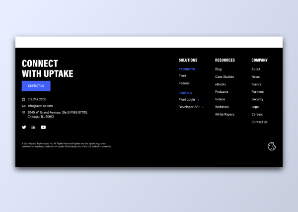
Some time after the initial update the business leaders decided to focus on one industry and product. Additionally, our graphic designer revamped the brand guidelines, limiting the color palette to create a clearer brand identity. This meant that the website required a color overhaul to align with the brand guidelines. I also took the opportunity to audit every page to ensure font sizes and UI components were used consistently, resulting in much tighter and cohesive UI design across Uptake's web presence. To get fresh eyes on the design of the footer section, I asked the graphic designer to create an initial pass on the layout, and together we created a more effective site footer with a clear call-to-action.
Enhancements
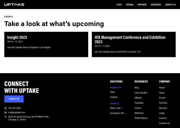
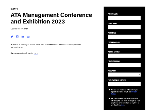
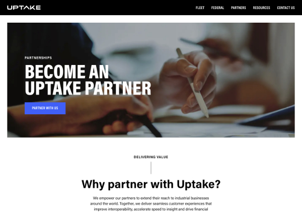
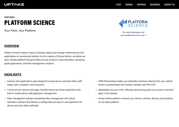
To align the site with marketing initiatives and partner relationships, I overhauled the events, forms pages, and partner sections of the website. On the front-end, I pulled events out of “news” to create a dedicated events section with an events listing page and individual detail pages. For partners, I added partner profile pages and updated the design and content on the partner overview page. On the back-end, I added the ability to have optional forms on event pages to increase lead generation, and implemented CRM integration changes across the site as needed.
Change Management
Background
At one time, Uptake leveraged a 3rd-party B2B marketing and sales enablement content management tool to engage with leads, customers, and partners. I was in charge of creating microsites for sales enablement and requirements for key partnerships. When the decision was made to leave this platform, I had to migrate microsites for campaigns in the field with a few weeks notice to an alternative hosting environment.
Transitional Solution
In order to accomplish this task in a short time, I determined with marketing what sites needed to be preserved. As a transitional step, I moved two site's assets (HTML, CSS, JavaScript, and images) from the platform and placed them in the root of the CMS platform we used for the main marketing site. I then coordinated with the admins of the 3rd party platform to redirect traffic to the new locations, and all other traffic to a 404 page explaining the migration for all other deprecated content (with custom messaging based on a unique domain of the traffic). I completed this transition before the end of the contract with zero downtime for the sites we kept.
New Feature in CMS Platform
A few months after initial migration, I developed a new section within our content mangement system (CMS) for the production and management of microsites. Microsites, for marketing's purposes, are sites that are intended to live for the duration of a campaign (no more than 3-6 months), and my previous microsites typically used a repeatable layout based on five unique, rearrangeable components. I leveraged the CMS platform's matrix field to define these components, thereby standardizing microsite layouts and making them easy to use by non-technical content managers.
Project Management
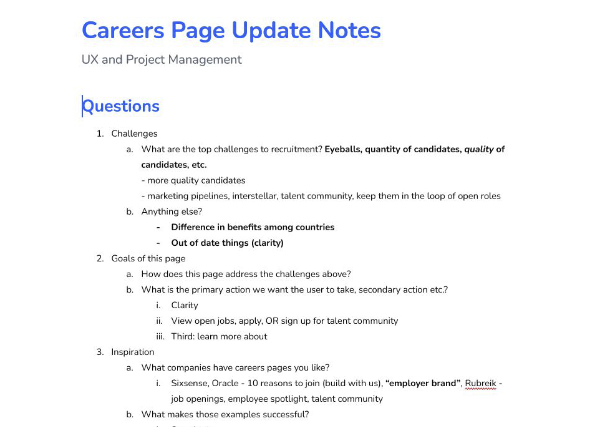
Often my role included project management, such as the time I received a request from my colleagues in recruitment to update the careers page. The project began with a list of requests, to which I followed up with the stakeholders and head of integrated marketing by hosting a kick-off meeting. In this meeting, I helped the stakeholders define their goals by asking them questions about their pain-points and challenges. In this process, I was able to narrow the list of requests required to complete the project so that I could fit it within the marketing team's schedule and to ensure all efforts actually supported the defined goals.
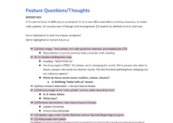
Later, I followed up by reviewing the tasks and determining the effort required to complete them on a 3-point scale (1: easy to do, 2: medium difficulty, 3: highest difficulty). I organized the tasks based on their priority and ease of implemenation to create an update schedule and presented these findings back to the stakeholders so they knew when to expect certain updates.
As I completed deliverables I kept stakeholders in the loop. I also communicated risk of delays due to awaiting further content or information from stakeholders, so the team understood the project status at all times. In the end, I delivered the project on time with minimal revisions to the project scope and with the enthusiastic approval from the stakeholders.
